


__twocolumncontent.jpg)


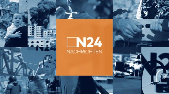
When Kays Khalil was tasked with heading up motion graphics on a rebrand of German news network N24, the agency found itself with an interesting quandary on its hands. The client “wanted a lot of images that show the diversity and vastness of its content,” said agency founder Kays Khalil, but at the same time “they wanted it to feel very light so you have the idea you can use it on phones, like a user interface.”
This is an ongoing, constantly evolving challenge in television design – the need to convey larger and larger amounts of data within a mobile aesthetic trending evermore toward simplicity and ease-of-use. It’s especially daunting in the news space, where global scope needs to be conveyed without feeling sprawling and chaotic. For N24, Kays Khalil responded to the call with an intricately crafted on-air grid system that serves as a clever portal to the content to come, using shifting panels to give a taste of the network’s awaiting feast of information and visuals.
Kays Khalil’s initial approach to the grid design leaned on expressions, a tool in After Effects that enables complex animations without having to create hundreds of key frames.
However, “it didn’t work out,” Khalil said, “so we decided to animate it by hand,” splitting each layout into its component parts and creating meticulous, dynamic fluctuations in size and behavior for each individual square. “It was hard work,” Khalil said, “but it was the best way because we used [the grid] in so many different areas of the channel.”
As a transitional device in and out of show opens and ad breaks, the grid not only looks like a very high-quality version of the panels and layouts we’ve come to expect from smartphones and tablets, but behaves like them as well. Panels move in and out of screen with the float-and-settle glide of a thumb swipe or scroll. Dominating the graphics, a flexible orange line serves as a multidirectional scroll bar that opens and unfolds into the images, information and typography at hand. Other squares on the grid are shrouded in blue, rounding out the N24 color scheme. Whether blue or orange, the veneer lets the viewer “see the abundance throughout the grid, but it’s also opaque,” said Khalil. “It doesn’t overwhelm you as a viewer.”
The grid panels also break out into variations of themselves across elements such as lower thirds, genre subtitles, and infographics that tail talent and footage like little bubbles suggesting endless possibility for analysis.
As intended, this visual theme travels well across N24’s various platforms, but it also has an added psychological benefit. Viewers increasingly enjoy watching content on mobile devices in part because it’s enormously convenient, but also because they have almost total control over what they watch and how they watch it. N24 mimics that tactile vibe in the linear space as well.
“The aesthetic should move,” said Djenna Wehenpohl, project manager at Kays Khalil, “to not only be able to be used on other devices, but resembling that touching of screens… It’s like the viewer is in control of it.”
Eventually, Kays Khalil would incorporate expressions into the rebrand, via a master file it created for use in N24 promos. Here, the network can input upcoming show dates and times, titles and other pertinent info, then sit back and let After Effects take over, automatically rendering the data into a trailer that pulls back from the theme a bit, showing how the grid can serve as much as a window as a transitional device.
“This was a very complex file,” Khalil said, but the end result was a simpler user experience for the client’s in-house team.
Kays Khalil got to make less complicated promos as well, including an airy series of spots for N24’s “Tipp” feature, an option for advertisers that lets them make use of network recommendations in categories such as Events, Finance, Music and Lifestyle. Sweet and simple compared to the intricate machinations of the network graphics, they consist of little more than camera moves across lovingly arranged assemblages of clothing, gadgets, instruments and other props. Edited from live-action footage shot in a studio, they show that curation and arrangement can be powerful design tools in themselves.
“One of my favorite parts of the project,” Khalil said. “I liked the visual concept. Very clean. It was fun because we got to do different kind of work… We had the freedom to do it like we wanted to do it.”
Tags: