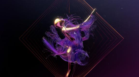
From clothing to music, spices and more, the countries served by HBO South Asia represent some of the world’s most vibrant and colorful cultures. So colorful in fact that when Australian creative agency Mirari & Co was developing its recent rebrand for the channel, it had to pull back on eye-popping hues just to stand out from competitors.
“Other [competing channel] brands were predominantly using a strong, bright color like red or orange,” said Jimmy Yuan, design director and co-founder of Mirari & Co. “So we chose a different approach, still using red, but in a different way.”
That approach has manifested in four striking idents for HBO South Asia, whose primary viewership resides in India, Sri Lanka, Nepal and Bhutan. To appeal to this varied audience connected by its shared love of movies, each spot uses glorious black-and-white computer graphics to pay homage to a different genre, guiding the viewer toward the HBO logo in fluid and surprising ways. In each, a perfectly timed splash of red makes the categories of science-fiction, action, fantasy and romance seem to burst off the screen.
Aiming for “a quite exciting camera move” in each ID, Mirari & Co ended up using motion itself to “create some connection between each world,” said Yuan. “That’s why we thought about using the different worlds’ scale to create a surprise element of showing the final logo.”
In the Fantasy ID, for instance, a giant mechanical elephant lumbers through a desert as the camera rises above it, zooming out to show this magical landscape is part of the grander realm of the HBO logo. And so it follows, we are to assume, that HBO’s fantasy offerings are just one part of a grander content realm.

Mirari dug deep to design the elephant, with Yuan finding combined inspiration from experimental architecture of the 1960s and the ancient tale of the Tower of Babel. The metallic beast’s movement across a harsh environment recalls the “Walking City” designs of British architect Ron Herron, who proposed intelligent, mobile metropolises as a way to better use resources and energy supplies. Other idents in the rebrand “are a little more straightforward,” Yuan said, but no less meticulously detailed. In the Sci-fi ID, a mishmash of iconic imagery from science-fiction films converges to create a thrilling sequence involving robotic bugs attacking some futuristic city. A spaceship swoops in to become the logo and provide that thematic feeling of movement.
Drawing from atmospheric classics such as “Bladerunner,” Mirari labored to bring the element of rain to the ID, a seemingly simple addition that required “lots of research and development,” said Yuan. “The final piece is a combination of 3D particles and 2D effects. The 3D particles are harder to do because they need to work in a really physical way. When they hit an object they will split themselves into different lines. There is a lot more calculation power required.”

Mirari used Autodesk 3ds Max to create its detailed animations, a software whose modeling capabilities allow for sophisticated movements around objects in space. This is perhaps no more evident than on Mirari’s Action ident for HBO South Asia, in which a scene of a thrilling gun fight and car chase pulls back to reveal the road it’s taking place on is part of the “O” in the logo. And in the Romance ID, red roses grow smoothly from the pages of a book, suggesting a pleasing merge of love and narrative.
The cumulative effect of the rebrand’s visual elements feels both classical and cutting-edge. The black-and-white colorscape is an homage to cinema’s rich history while the slick, sculptural quality of the graphics feels like a promise of cutting-edge premium content to come. The viewership of HBO South Asia varies wildly, but in letting the essence of film itself guide its process, Mirari & Co has managed to create “something suitable for everyone,” said Michelle Xie, producer at Mirari & Co. “Everyone needs to watch movies.”


[Images and video courtesy of Mirari & Co.]
Tags:
























__twocolumncontent.jpg)


