


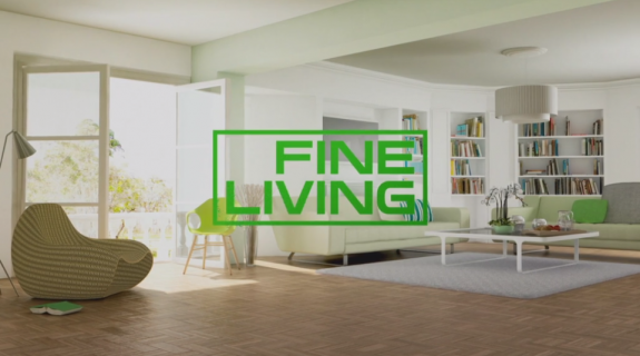
__twocolumncontent.jpg)


Already broadcasting in more than 70 territories throughout EMEA, Scripps Networks International’s Fine Living added Italy to the mix back in March of this year. And, just to make things interesting, the home, food and travel networks all simultaneously rebranded.
The challenges in designing a media brand that can stay accessible and relevant across such a broad swath of cultures are formidable, according to Nick Thorogood, SVP of content and marketing EMEA at Scripps Networks Interactive Inc.
“Every territory is different and you need to find the right combination of elements to engage,” he told Brief. “In Italy, the food and drink culture is hugely important, but in the Middle East there are cultural differences you need to be sensitive to. When you are trying to appeal to a very diverse audience, you have to think about hitting universal truths, those universal symbols of recognition that perfectly resonate.”
The task of designing something that could fit that description without being bland went to BDA Creative, a European agency who knows a thing or two about global media branding. Assessing Fine Living going in, BDA creative director Gregory Millar said he saw a channel that “felt quite eclectic” with “a good mix of different programming… effective in its presentation style but maybe a little too passive.”
Millar’s team saw the opportunity to make Fine Living’s messaging more direct by accentuating what they identified as five genres or “pillars” of well-being that came through on programs ranging from “House Hunters International” to “Luxury Uncovered” with Jenny Powell: DIY, Cuisine, Travel, Home and Style. “That’s a really lovely set of different subjects,” said Millar. “When we rebranded we ensured each one had equal importance.”
BDA’s approach involved a set of core idents – one for each one of the five pillars –depicting carefully selected familiar objects floating serenely in the given pillar’s natural environment before floating together to form the Fine Living logo. In the ident for Travel, for instance, a globe, sunglasses, luggage and other iconic vacation-related items hover in an airport before solidifying into the network’s logotype.
This idea of connected objects creating a greater whole within a beautifully wrought space “felt very fresh and dynamic,” said Thorogood. “It felt like a piece of artwork. It was contemporary, and visually it was something that as soon as you caught it out of the corner of your eye, you would try to make sense of it. It created an instant sense of engagement.”
Originally planning to photograph the objects in front of a green screen then animate them over still photos in post-production, BDA ultimately settled on an all-CG approach for the idents in order to have greater control.
“To actually build a computer-generated environment means we had a completely computer-generated setup to work within,” said Millar. “It’s amazing what you can do [in motion graphics] with depth of field and building different lenses in and all that. You’re basically controlling the objects in the same space but with the same lighting.”
The CG also allowed BDA to implement an incredibly fluid, almost balletic movement in the objects, allowing each ident to reach its final image with exquisite grace.
“There is something really beautiful about all of these objects moving, and as they move, their greater parts create a whole,” said Thorogood. “They all start traveling together and creating this amazing undulating rhythm that you get hooked in on, and suddenly they transform into the solid brand.”
That undulating, almost hypnotic rhythm is further accentuated by the music of the rebrand, a dreamy soundscape composed by London-based sound designer Travis Hefferen.
“Often people think the idents are primarily about a visual experience but sound is always half of the experience,” said Millar. “We wanted the music to be contemporary but also have life beyond 2014 so when it’s still running in a couple years time it won’t feel dated at all.”
Part of BDA’s process on every project, said Millar, involves writing an audio brief for the project’s musician. For Hefferen’s Fine Living brief, the language included words like “optimistic,” “inclusive,” “contemporary,” “positive” and “uplifting” – adjectives that add up to a pleasing, open effect in any culture where the network may be broadcasting
“Fine Living is not an exclusive place,” said Millar. “It is not somewhere that wants to be aloof from its audience – it wants to be a channel for everyone to enjoy, but also to enrich people’s lives in learning how to do things in a different way. All in a very relaxed, inclusive, accessible way.”
“What you have here is a mixed-genre channel,” added Thorogood, “and we’ve worked out how to show those pieces coming together to make something hugely special.”
Tags: