


__twocolumncontent.jpg)


In the retail world, electronic devices are often divided into two separate color groups: White goods include essential appliances such as washing machines, refrigerators and range ovens, while Brown goods include the non-essential yet joy-producing items such as DVD players, stereos and televisions. It’s a distinction that hasn’t historically had much use in entertainment marketing, probably because Brown retail goods and entertainment products are part and parcel – you can’t have one without the other.
But what does happen when you apply the Brown/White retail categorization to an entertainment brand? What does it look like when the content we consume gets divided into what we need (White goods) and what we want (Brown goods)? Recently, German agency UnitedSenses decided to find out – when it participated in an international pitch process for the new branding of Greek pay TV service Cosmote.
Part of Greece’s largest telecom provider, OTE, Cosmote is a media brand portfolio that was launched in 2015 to freshen up its parent company’s internet and phone services. Eventually, it became clear that OTE TV needed to be ushered into the Cosmote fold as well, and UnitedSenses had an idea for how to do it that would connect the service to the new Cosmote brand while also highlighting what makes pay TV special as compared to the company’s telecom offerings.
“If we were to compare this with an electronic goods company, it would have White-label brands and Brown-label brands,” said UnitedSenses CEO and Creative Director Markus Schmidt. “In a communications group like OTE, the mother company of all Cosmote brands, the White goods would be fixed-line telephone, online service, mobile services. True companions. On the other side of the store you find Brown goods (television sets, stereos, games). You do not need them but you want them for your entertainment. In the OTE family, this would be pay TV.”
That simple distinction was, Schmidt continued, the “strategic winner” on the pitch, a perfect branding metaphor that tied Cosmote TV into the overall Cosmote branding universe while also highlighting what makes it special. After all, Schmidt continued, unlike phone and internet services, pay TV is “a premium that you give to yourself. It’s not something you must have; it’s something that’s nice to have.”
Translating the White/Brown concept into a design ethos was a matter of assessing the existing branding for the company’s telecom services, which was dominated by a “universe which was predominantly white,” Schmidt said. “A white background with green and blue colors on it.”
This, he continued, was “a nice coincidence,” because those “White-label” offerings were literally the color white, but also because it was immediately clear how the less necessary yet more fun and indulgent “Brown-label” Cosmote TV offering could be offset from its staid siblings. Referring to the pay TV service as Cosmote’s “sexy sister,” UnitedSenses proceeded to apply the universal signal for seduction and allurement.
“We switched off the light,” Schmidt said, “and created a dark, primetime feeling.”
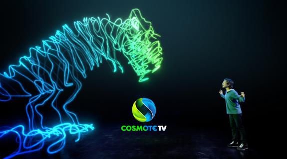
Entering this sultrier, more luxurious dark space opened up the branding universe for Cosmote TV. In this realm, UnitedSenses could breathe powerful new life into the brand’s blue and green colors by turning them into light that crackled and popped against the black backdrop. Designing Cosmote’s platform brand as well as its Cinema, Sport and History channels, the agency produced more than 30 idents that take its “light in the dark” premise into strange and delightful places.
Each ident features real people actually doing things within the darkened realm of the Cosmote TV universe, a place that lets them “envision their fantasies,” Schmidt said. “You could say every ident is staged by a subscriber, but they are not passively watching; they are in the middle of the action. They are the center of our universe.” The inclusive vibe also helps tie the pay TV service to the overall tagline of the Cosmote brand: “Our world is you.”
Besides connecting Cosmote TV to the overall brand, UnitedSenses also had to form connections within the TV service – between genres such as travel and crime, and between the technical components including the OTT platform and the Sports, History and History satellite channels. To link these subsections of the brand, the agency concocted what is literally “the connecting line between everything,” Schmidt said, a glowing green-blue navigation device that shifts, shimmies, stretches and wraps to pull the viewer through every kind of content. The line is a marvel of on-screen economy, “the most reduced element of design that you can think of for that whole branding package,” Schmidt said. “It literally contains the full DNA of the brand in that one line—it’s made of light, it has the [Cosmote] colors, it stands up against the dark background, and it becomes the logo when it collapses.”
Ten months in the making, Cosmote TV is proof that the best-designed brands are built from the simplest brand strategies. “It’s really what the word ‘branding’ represents… that each and every element of an on-air appearance is referring back to the brand,” Schmidt said. “In two years time, everyone in Greece, when they see a green or a blue light in the dark, they will think of Cosmote TV.”
CREDITS
Cosmote TV:
Head of Marketing: Marianna Psomiadou
Head of On-Air: Theodora Baka
Project Management: Athina Panagiotopoulou
UnitedSenses:
CEO & Creative Director: Markus Schmidt
Art Director: Sebastian Schneider
Designer: Ariane Gebhardt
Audio Design: Hofkapellmeister, Sebastian Müller
VFX: Ignyte, Leif Petersen
Tags: