


__twocolumncontent.jpg)


Pay television, according to Pablo Alfieri, creative director for the Argentina-based agency Plenty, “is characterized by an audience with more exquisite taste, which seeks to watch exclusive and high-quality content.”
The trouble is, he continued, “with the eagerness to appear as premium to this kind of target [viewer], the channels usually end up being distant and cold.”
It’s a fascinating idea, that premium channels lean toward branding themselves in a way that ultimately distances the viewer, and it makes a kind of sense. There is a fine line, after all, between what might be considered high-end and what might be considered elitism, and sometimes – maybe frequently – the line is nonexistent.
About a year ago, Spain’s biggest pay channel Canal+ was, if not elitist, at the very least “elegant, minimalist and too serious,” said Pablo Rubio Ordás, founder and creative director of Erretres, a Madrid-based identity and design consulting firm. Erretres is one of those companies that seems capable of creating anything, whether it’s custom book publishing, app design or elegant packaging and environments. Canal+ had brought them in to help the channel lighten up a little – to, as Plenty’s Alfieri put it, “generate empathy with the audience.”
Plenty would enter the picture a bit later, coming in to execute Erretres’ vision in the Canal+ on-air branding. First, Erretres had to rebuild the foundation off-air, to renew the brand’s connection with its audience through a completely new identity. It sought to do so by taking the Canal+ platform’s five million users and placing them at its core, by “making them the channel’s true protagonists,” read a statement released by the company.
The comprehensive rebrand that ensued would encompass broadcast identity, website and online presence, social networks, retail spaces, vehicles, corporate graphics, and even internal and external communication. Meanwhile, the logo, CANAL+, and its lean Futura typography, would go untouched; it still had work to do in its present form. While the design scheme changed fundamentally around it – flattening and suddenly bursting with pure shades of vibrant color – the familiar logo was offset and heightened by its new surroundings. It became malleable, transforming into a window for incorporating images into whatever media it was gracing, and then into a dialogue box that serves as a graphic tool for the incorporation of titles, messages, hashtags and, perhaps most importantly, the users themselves.
“Very early on we decided that the images had to eliminate any complicated visual effect,” said Ordás. “Just raw color. Now Canal+ is younger, fresh, direct and bold and, among everything, is listening.”
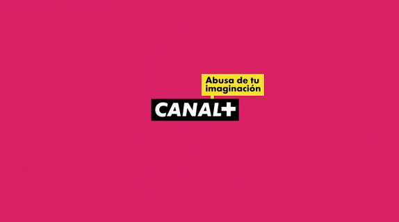
Just being listened to is all anyone wants, right? And pay channel subscribers aren’t any exception. Letting the branding serve as a kind of window to the content created a more urgent connection between viewers and Canal+. Now, it was time to make that sensation literal, by letting viewers create their own Canal+ bumpers through the “Abuse Your Imagination” campaign and website, with the best ones actually making it to the air.
As Canal+’s new, more inclusive identity was nearing completion, Plenty was wondering how they could win the bid to bring it on-air. An idea began to materialize involving the user’s finger, and creating the illusion on the TV screen of it swiping across as it would on a tablet or other mobile device as a kind of transition between programming. Naturally, an on-screen finger wasn’t the most practical notion, but it did give Alfieri’s team the “the idea of replacing the finger with the channel icon, the ‘+.’” That inherently positive little plus-sign could be the guide, serving as kind of pointer, opening up Erretres’ windows, sifting through an on-screen gridwork system until it located the next offering.
Plenty would later learn from a Canal+ insider that the plus-sign “was crucial to make the decision of who won the bid,” said Alfieri. “[The Canal+ creative executives] remarked it was THE element for the channel.”
Some disarmingly whimsical emoticons designed by Erretres further fleshed out the on-air packaging and Canal+’s newer, chiller vibe. “We brought them life, took then to the center of the screen, exploited them to the fullest and used them as an excuse for the pieces to have story,” said Alfieri. “They were fun for us and the audience and along with the ‘+’ were the core of the strong personality of the Channel.
As for picking up the pieces of another company’s inspiration to try and create their own, Alfieri said parlaying Erretres’ work to the screen “was a tough job for us since we had never done a channel rebrand based on work already designed by another study. In this case Erretres’ guys did an excellent job – all the resources were there to be used!
“From the beginning we wanted the audience to have a unique, intimate experience,” said Alfieri. “To be a protagonist on the screen.”
Tags: