


__twocolumncontent.jpg)


The advent of mobile technology is quickly flattening television design as we know it, crushing 3-D elements into 2-D landscapes that are sleek, economical and easily navigated by fingers on tiny screens.
Nowhere is this seismic shift more evident than in the realm of sports, where for years “everything was 3-D, and very bold in terms of the spectacularity of it, as if you were in a light show,” says Patricio Verdi, executive producer for Argentinian design agency nxtid.
These days, Verdi continues, the sports world “is moving toward a very clear identity, and to be very functional in terms of giving information. When you are watching a match in any sport, there are a lot of stats, clocks, the scoreboard, [etc]... All that is going more flat and more clear with solid colors.”
While that all might sound a little dry in theory, it is in reality quite the opposite, as evidenced by nxtid client Bundesliga’s recent brand refresh. The German soccer league’s new, highly modern look and feel is proof positive that what sports graphics are losing in terms of gloss and sheen and thunderous drama, they are gaining in terms of fluidity, elegance and nuance of color and tone.
Working closely with Bundesliga’s digital marketing arm, DFL Digital Sports, nxtid designed and produced new national and international broadcast opens for the 2017 season, as well as graphics for an array of highlight shows and other programs in and around the games themselves. Swift and spare, the new elements are built on a grid system of layered rectangular cards that slide left and right in different horizontal configurations.
The goal with the motion design was to visually articulate “the things that you usually do with your computer,” Verdi said. “When you see the sliding cards it’s like when you are swiping with your iPad or iPhone, and the changes in sizes are as if you are pinching with your fingers or with your track button.”
Though the way we thumb our devices can be multidirectional, the movement of Bundesliga’s branding is strictly horizontal, never up and down, evoking a sense of classic German precision no matter what team logos, images, game footage or other information occupies the cards. Additionally, while the cards can be zoomed in or out on, changing dimension, the ratio of their parameters remains static. No matter how much space they take up, that area is always a multiple of the brand’s core building block, the Bundesliga logo.
Working with German design agency Mutabor, DFL Digital Sports began the process of revamping the logo more than a year and half ago, removing its 3-D gloss and sharpening the rounded edges into rectangular corners. The image of a soccer player kicking a ball remains essentially the same, only now the figure looks forward rather than down at his own knee, and now the ball itself is inside the logo, whereas before it was perched directly on the outer border of the mark, as though halfway in and halfway out of bounds.
“It’s a very subtle change, but for us it was really important that this little ball comes on to the red field and becomes an integral part of the logo,” said Thomas Markert, director of digital design at DFL Digital Sports. The end result is not only a “nice improvement in regards to symmetry,” he continued, but its seamless edges create the panel shaping that informs all other cards within the new on-air 2-D motion methodology’s grid framework. Symmetry begets symmetry.
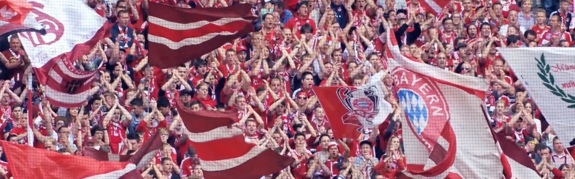
With historic teams such as Bayern Munich and Borussia Dortmund in its fold, Bundesliga is a global sports powerhouse, and probably Europe’s top soccer league after the UK’s monolithic Premier League. Both organizations have rebranded in the recent past, and it’s fascinating to see how they have diverged from each other aesthetically.
“Premier League left football behind in a way,” Markert said. “Its main brand identifier is now a lion’s head. The colors they are using are very neon and very far away from club colors. [Bundesliga] went completely the other way with our brand. It’s all about the football, the football player. We also embraced the club colors and the club logos much more. We don’t cut off the logos anymore. We show them in their full beauty. Across the first and second [Bundesliga] league there is a really beautiful potpourri of logos, and with that also comes colors and secondary colors. That’s what we really embraced and what we’re playing around with and having an even further evolution of the brand.”
CREDITS
Production Company: NXTID
Client: DFL Digital Sports - Bundesliga
Creative Director: Thomas Markert
Art Director:Juan Pablo Kessler
Producer: Simon Hallmann, Michael Jaksch
Director: Facu Labo
Executive Producer: Patricio Verdi
Producer: Natalia Kosinski, Agustina Santkovsky
Art Director: Josefina Llano
Music and SFX (Bundesliga Hymn version): Mil Cables (Juan Tortarolo)
BL Opening 2017/18:
Art Direction: Josefina Llano
2D Animation: Juan Casal, Lionel Skilliar, Esteban Blanzquez
BL IPP:
Art Direction: Josefina Llano, Javier Jauregui
2D Animation: Lionel Skilliar, Esteban Blazquez
3D Animation: Matías Furno, Gastón Duranovich, Pablo Brancatella
Music and SFX: Mil Cables (Juan Tortarolo)
BL Digital:
Art Direction: Josefina Llano, Javier Jauregui, Lucía Izco, Alejandra Lan
2D Animation: Lionel Skilliar, Esteban Blazquez, Atlántico Estudio
BL Video Assist:
Art Direction: Lucía Izco
Graphic Design: Flor Tasso
Character Design: Franco Vecchi
2D Animation: Lionel Skilliar
Tags: