


__twocolumncontent.jpg)


AMC’s Preacher is both serious and funny, sentimental and violent; a series steeped in faith and mythology, while maintaining religion as an undertone of the show.
“It’s kind of wild,” said Picturemill Creative Director William Lebeda. “In that way it was hard to pin it down to one thing.”
Yet as the driving force behind the main title sequence, that’s essentially what he had to figure out how to do. Being familiar with the comic book series upon which the show is based, and after watching the pilot episode and marketing around it, Lebeda decided that, if anything, the tone was intense.
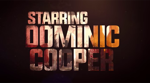
Which got the designer thinking about the intensity of giant typography. And he wondered, “How big can we make the word ‘preacher?’”
Big enough that it “smacks you in the face with the same intensity of the show?” So large that it delivers a “boldness that knocks you back when you see the word on screen?”
With that concept in mind, the main title sequence for Preacher was born.
Lebeda used large fonts to display the credits, with quick, often times close-up footage from the series that were masked inside the text to create a continuous and well-paced transition from one glimpse to the next.
He chose shots that were important to the storyline yet simple enough to digest in 17 frames, that also left room for ambiguity: an image of main character Jessie buttoning the collar of his clergy shirt; someone snorting cocaine through dollar bill; a car spinning out on a dusty road; a hand pulling the trigger of a gun.
“The first time you watch it you’re not sure what you’re seeing,” he said. Viewers are left wondering about the significance of certain shots until they are put into context as the season progresses.
“Everything means something,” Lebeda said. “There was nothing in there that we just put in there. Well, maybe the cow.”
But with the next frame showing a package of cubed meat, even that speaks to the irreverence and dark humor of the show.
Lebeda knew had a few shots he knew he wanted to include—like the scene of two mascots fighting—and he knew he wanted to end with Jessie walking toward the church.
“Once we had a few in place, it was just a matter of trying things,” he said. Like putting together a puzzle, Picturemill experimented with different pieces, running “a lot of versions” by AMC and constantly tweaking, adding and moving elements around until it was just right.
The last pieces wound up being the coffee can and finally, the radio wall.
“We didn’t know we needed it, but when it went in, everyone was like, ‘that’s it, we’re done,’” he said.
The process “came together pretty quickly,” taking about six weeks from the end of March to early May, 2016.
Adding the gravity of gospel music to the sequence tied it all together by emphasizing the importance of the church, and creating an aura that is both sad and uplifting at the same time.
“Every little thing” he said, “made a big difference in the tone.”
Tags: