


__twocolumncontent.jpg)


Left or right, rich or poor, differently abled, black, white, gay or straight, ABC’s new rebrand is designed to point a lens at fact that the network aims to present stories representative of all Americans.
The new look from creative agency The New Blank stems from the divisiveness in the country that accelerated after the 2016 elections, and ABC’s goal to paint a more inclusive view of the country.
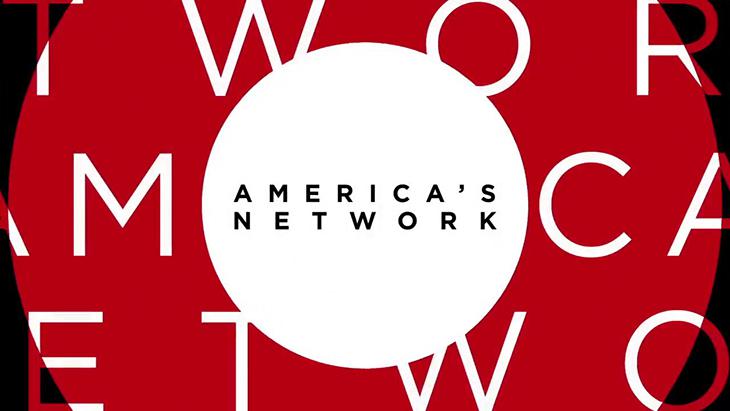
A year in the making, the agency developed a design package that showcases ABC’s new tagline, “America’s Network” and brand direction using a simple elements that easily flow between different genres, formats, daytime and nighttime programing, print, and digital extensions.
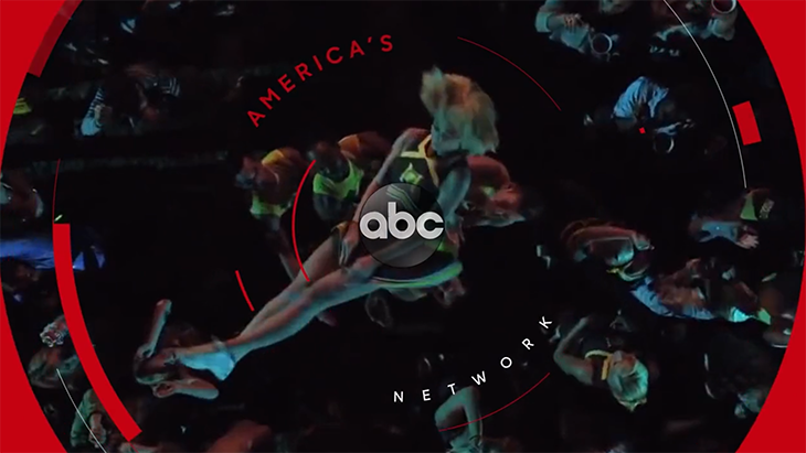
“We ended up developing the look we called “Aperture,” styled after the idea that ABC was swinging the camera around the country gathering these stories from real, everyday people, and the viewer is reflected in the lens,” says The New Blank in its breakdown of the project. “The television screen (or laptop or tablet etc.) becomes the camera looking back at the viewer; the ABC programming reflective of the viewer.”
With that in mind, the looks leans into a circle design, relying heavily on rings and curves in assets such as opens and closes, entags, styleframes, lowerthirds and bumps, as well in the animation of the ABC logo.
To match ABC’s marketing shift to focus more on its programming than brand presence, The New Blank simplified the pallet from three colors to one, playing up red graphics to streamline the communication.
“We developed a scheme of assets that could be colored to match the primary and secondary colors as well as typography of individual show branding, while leveraging layouts and animations from the network branding,” says The New Blank.
To create customizable promos, the agency created a design package of After Effects templates to fit a range of needs and sizes, and which is simple enough to accomodate rushed schedules, as well as be adopted by affiliates around the country with varying degrees of technological savvy.
In addition, to fit the different moods of programming and genres, The New Black created “uptempo” toolkits a fast, snappy animation style and large, bold typography, as well as “dramatic” toolkits where the typography was more sophisticated with a wider tracking, and smaller point sizes.
The “Aperture” rebrand began rolling out over the summer and is being featured for fall programming.
CREDITS
Directed by: Bobby Hougham
Design Team: Vince Diga, Eric Edwards
Design and animation team: Eric Edwards, Marcus Kulick, Andy Musser, Sam Rohr
Executive Producer: Sevrin Daniels
Creative Directors: Sevrin Daniels, Bobby Hougham
Network: ABC
VP of Brand and Creative Management: Pash Pashkow
Executive Design Director: Lucas P. Aragon
Senior Design Post Producer: Gilda Reinert
READ MORE: NewscastStudio
Tags: abc