__twocolumncontent.jpg)


Orange telecom’s OCS has been France’s exclusive home for HBO programming since 2017. The three-channel, one-platform network also has an output deal with Sony Pictures Television for blockbuster series and films and it has worked hard to develop its own roster of innovative programming through its OCS Signature banner, not to mention a 100-million-euro collaboration with Orange Content that has resulted in global hits such as the Italian series The Name of the Rose and financial thriller starring Patrick Dempsey, Devils.
It all adds up to a media enterprise that, even with its HBO contract ending at the end of this year, feels like France’s leading provider of premium content. And now, thanks to a rebrand designed by Promax Europe’s 2020 Agency of the Year, Gédéon, OCS looks the part as well.
“Working for such a high-quality brand is always a great pleasure because you know that everything you create will be used to showcase amazing fictions and programs,” said Lazare Bessiere, artistic director for Gédéon. In the case of OCS, Gédéon didn’t just showcase the network’s fictions and programs – it found a way to let that content frame the brand.
“What can I take from the programs themselves?” Bessiere asked himself at the rebrand’s outset. “How can the branding be tied to the content? An interesting challenge for every media brand, and especially for OCS, was to be able to give the content center stage… but also find a way to put the brand upfront.”
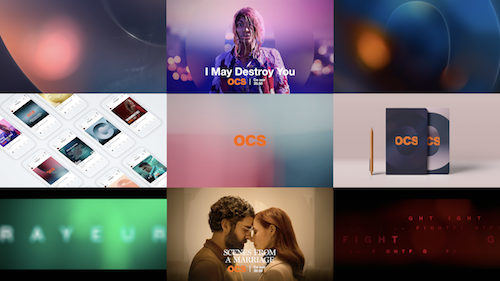
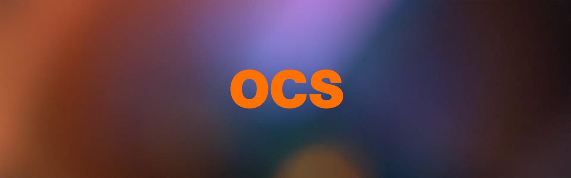
Bessiere and Gédéon found this coveted sweet spot by using the OCS brand to literally spotlight its own content. The concept begins with the new logo animation, in which the “O” in “OCS” swivels on its axis, casting orange light on the brand’s core offerings, movies and series. The effect is both illuminating and alluring as the O blurs and then recedes as it goes, drawing the viewer in by letting the upcoming content sharpen into focus as the letter completes its sweep.
It feels a bit like rack-focus, a camera technique that is a signature move within OCS’ cinematic, premium content and therefore serves as an effective brand signifier. In this case, it also happens to be practical. It “doesn’t add any color to the branding,” Bessiere said, but instead transforms the already existing shades of the programs themselves itself into their own “ever-evolving color that is both true to the content and ownable by OCS.
“It was for me the most interesting part of the rebrand as it’s the content itself that creates the identity of OCS,” Bessiere added. “The depth-of-field blur is an incredible tool to create a graphical element based on the abstraction of the content.”
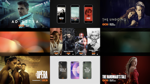
In the below example, it’s clear how OCS’ new idents and bumpers “all use footage of OCS programs as their basis without any added colored graphical elements,” Bessiere said. “By feeding the system content you are able to refresh these elements infinitely.”
The depth-of-field approach is also crucial in manifesting “three core aspects of OCS,” Bessiere said: “immersion, emotion, and expertise.” The immersive quality of the logo animation is discussed above as well as the aura of expertise lent by the rack-focus effect, one of the most challenging techniques in a camera operator’s toolkit. The emotional component springs from there – it’s that little tingle that spreads down your back when you’re watching something beautifully and expertly crafted, and you know you’re in good hands.
The rounded swoops of the OCS logo and its clever sound design also play into the brand’s emotional heart. When not lighting things up, the mark stays busy, its soft, curvy pieces offering a subtle disruption to the proceedings as they hover and wipe, scale up and down and in and out before taking center stage again with an orchestral flourish that culminates “in a short breath,” Bessiere said. “that’s both human and organic and strongly evokes all the emotions one feels when watching good fiction.”
To help make the OCS soundscape soar, Gédéon brought in La Plage to score the music, a French band that specializes in evocative film composition. Their resulting music was engineered by Alan Meyerson, a Hans Zimmer collaborator and “the master of Hollywood movies and series mixes,” Bessiere said. Meyerson added an “infra-bass touch” that “took La Plage’s composition even deeper in the cinematic realm,” Bessiere added. Comparing the result to Netflix’s “very synthetic ‘tuDUM,’” he described this effort as “the sonic signature of OCS… something human and aspirational to strongly differentiate it from what the competition does.”
Netflix and its streaming brethren, after all, are now OCS’ primary foes. Even its longtime partner HBO will soon become a competitor, as the American network brings its own streaming content away from third-party broadcasters like OCS and under its own global umbrella. OCS needs more than great content to fill the gap – it needs a brand that looks and sounds amazing across every modern viewing format.
“By tackling every touch-point, we were able to bring richness and consistency to the brand,” Bessiere said. “It was exciting as we were asked to rethink the global experience of the brand in a truly 360-degree approach… We created an agile system enabling us to channel different levels of branding depending on the touch-point. We defined places for OCS to express strongly and for the brand to give space to the content.
“It’s all about giving space to the amazing content,” he repeated, putting one last spotlight on what really matters.