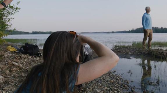
Guillermo Stein often has a vision in which he’s walking along an endless corridor full of doors. All of the doors call to him, creating the difficult decision of which to choose. Opening one means abandoning the others.
This hallway is a vital image that for years has haunted the president and CEO of Steinbranding Design Studio. It also is the image that symbolizes his professional exploration.
For him, life and creativity go hand in hand.
An Argentine graphic designer, Stein spent five years studying in Jerusalem. It was there he developed the goal, shared by many students, of one day working at the Museum of Modern Art in New York City.
However, he spent the first 15 years of his career working for the Eurnekian investment group, which at the time owned media interests as well as airports and other assets. As director of corporate identity and audiovisual image, he became an expert in the field of audiovisual media. Initially, the job had nothing to do with the ideals of his youth, but he managed to transform that work into something more meaningful to him.
“I realized that was my MoMa. I was part of a mass communication media that reached all Argentines alike,” says Stein. “I could work on my dreams in that model.”
Until the moment came for him to open new doors.
“I had always wanted to have my own studio and I was putting it off because what my job was offering me was wonderful,” he says. In the late 1990s when the Eurnekian group sold its media business, which included radio stations, newspapers and a television channel, to focus on Argentine airports, it was the push he needed to create Steinbranding.
A Studio is Born
He set up a studio in April 2000 as a pioneer project.
“We had this new energy where television channels could go in search of new ideas,” says Guillermo.
He named the studio “Stein” from his surname, combined with the word “branding,” a concept that wasn’t popular at the time. It was a strategic name that “let [clients] know that I am behind each and every project,” he says.
Since then, Steinbranding has been carrying out all types of projects, becoming one of the first studios to hire multidisciplinary designers and creatives to work on all levels of TV production, including channel branding, promos and development. The business also includes a photography and recording studio.
Steinbranding has developed the image and branding for more than 50 channels worldwide, which has led to the slogan: “We haven’t been introduced, but we already know each other.”
In creating this new MoMa, Guillermo searched thoroughly and chose a beautiful space in the neighborhood of Palermo, in Buenos Aires, which was nothing like the typical cave of old television channels.
“I’m a lover of light and aesthetic things. I wanted my studio to be all about this,” he says. From the street Steinbranding is unrecognizable, but opening the door is like stepping into another world.
“It’s a kind of passage.”
At first the studio explored a more aesthetic and boutique-like look, working for channels such as El Gourmet and Film and Arts, which meant “going beyond ‘fast TV’,” says Stein.
Building Visual Identities that Break from Tradition
Fox Life joined the portfolio and for the first time, the studio created branding that did not have the typical corporate seal of a square or a rectangle, with typical credits common at the time.
“We broke away from the more minimalist and rational design and template we were used to, to approach the language of art,” says Stein.
Steinbranding grew into the studio that was entrusted with the animation, design and production of Fox Latin America’s new identity.
“The challenge at that time was to build a visual identity that matched the channel’s positioning: Smart Entertainment with an Edge. The objective was to visually capture a lighter, funnier, more modern, more cheerful and more youthful image, that allowed us to create an original visual language,” says Corina Capuano Saccone, vice president global creative and marketing team of the Fox Networks Group.
This language focused on the letter “O” from Fox as a main graphic element. Creatives found that the letter had a peculiar form if a pill-shaped center was introduced in it.
“Both elements were unique and we decided to build the visual identity around them,” Capuano says. “Steinbranding brought the necessary resources in terms of ideas, talented people and design, so that Fox’s identity stood out.”
From there, Steinbranding’s portfolio grew to include more international channels, such as Mexican station Azteca. The studio also frequently worked with channels in India, including the development of 15 channels, namely MTV, Nickelodeon, Zee and Sony.
How Steinbranding Captures Culture
But if there is something paradigmatic in Steinbranding’s track record, it is its mark on Argentina’s identity and territory. The visual identity of Canal Encuentro stands as an emblematic project because “it broke the model that branding of an educational channel has to be boring,” says Stein. “The pieces presented the channel in a transgressive way and helped position it.”
The studio’s high note came when it created the image campaign for the state-owned channel Televisión Pública Argentina, in which case Stein thought deeply about the true identity of Argentina, a territory built by Spanish and other European immigrants , where indigenous people and gauchos also thrived.
This fusion failed to recognize the new Argentine culture since it has lost its gaucho and terrestrial elements.
“In effect, it wasn’t a fusion; it was a battle won by modernity and rationalism,” he said. The native aspect has evolved into handcrafted arts and crafts.
So Stein decided to play on the idea of weaving, a craft native to the country. Indigenous communities in some parts of the country still make their own hand-woven textiles.
To push through this idea, first Stein developed a pop art and then an op art. Over the course of a year, Steinbranding created 240 bumpers and boards to mark the beginning and end of commercial breaks.
As a result of this work, Stein created the following case study called “Argentine Design for Argentine Public Television.”
As for new projects, Steinbranding is working for an Indian channel that will be launched in Latin America, but details are pending.
As the studio has grown, its track record shines in the meaning behind its own logo: a shape that resembles a television with two bright lights.
“It was born as a mixture of a light in the storm,” says Stein. “I wanted to make a kind of beacon or signal and, as time passed, it was turned into a neat, aesthetic and carefully-designed abstraction.”
The spotlight brightens up the search in the corridor, illuminating the path behind whichever door is opened.
“Maybe,” Stein says, “if I reveal the light to others, I can reveal it to myself.

RELATED: Creative Review: Cómo Steinbranding Capturó la Identidad Argentina a Través del Diseño (Version Español)
Tags:



























__twocolumncontent.jpg)


