


__twocolumncontent.jpg)


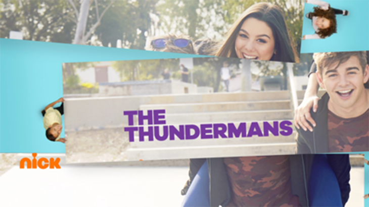
With a strong history of successful rebrands, Buenos Aires, Argentina-based Superestudio — PromaxBDA’s design partner for The Conference 2017—incorporated live action and a mix of techniques for two projects: Nickelodeon in the U.S., and TMC in France and Monaco.
Its Kids First for Nick
“Nickelodeon needed an image refresh, which it hadn’t done in many years,” said Ezequiel Rormoser, creative general director at Superestudio.
The studio worked with Michael Waldron, Nickelodeon senior vice president, creative director, art and design, and his team on a brief that incorporated real children into the branding to set Nick apart from competing channels.
RELATED: Nickelodeon Refreshes Its Brand With Help From Superestudio
How TV Brands Are Distinguishing Themselves in an Age of Distraction
Superestudio focused on two concepts set out in Nickelodeon’s brief: Kids First, a tagline that the channel was already using, and the idea of unexpected fun, to develop a project with more than 300 assets.
“We turned these two concepts into a kind of tagline, be real, be playful, be unexpected, and we added the idea that these children were interacting with the channel and its content,” says Rormoser.
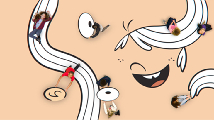
To translate the idea into images, the studio mixed techniques.
“One of our advantages is that we are not fixed to any particular aesthetic. We do have a style, but this has to do with our capacity to handle different techniques and apply them depending on the project, from 2D, 3D, live action to combining these three, which is precisely what Nick is,” says Rormoser. “With this mix the children became part of the channel. They were inside it, in a unique and playful way, interacting with the brand and with the contents.”
Superestudio also brought the idea of “unexpected fun” to the promos. “We were inspired by social networks and memes to generate a language of its own, mixing the children with the channel content, as well as mixing live action, 2D and 3D,” says Rormoser.
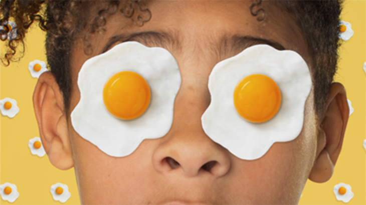
The result is a fresh and playful proposal, with funny moments in which children interact with the characters, such as playing with SpongeBob’s face or inventing situations displayed in a style inspired by Cubism.
“The most important thing is that children felt represented and involved in what they normally see on screen. It was all about being part of it,” says Rormoser.
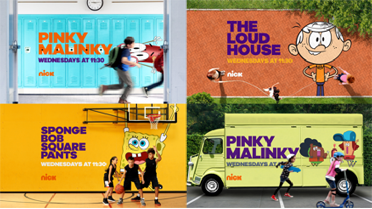
Superestudio also updated Nickelodeon’s existing logo, and evolved the channel’s orange-based color range into a broader palette. The live-action shoot took place in Los Angeles, through a partnership with production company NuContext Creative.
TMC Goes for a Perfect 10
For TMC—a channel based in Monaco that was acquired by TF1 Group and repositioned as an entertainment channel—Superestudio updated the brand for a more modern look based around new host Yann Barthès, who joined TMC from France’s Canal+ .
“To create the channel’s identity, we focused on his personality: a smart, cool, yet irreverent political journalist,” says Rormoser.
Superstudio was inspired by Barthès signature outfit of a suit with sneakers. The studio determined this look is “80 percent elegance and 20 percent coolness,” and labeled it a “twist attitude.”
This 80/20 formula became the rebrand’s foundation. For example, the typography used was 80 percent sans serif and 20 percent italics. The color palette was 80 percent red, white and blue (the colors of the French flag), and 20 percent edgier and unexpected colors, such as mustard. In another example, the animation was mostly smooth, but was occasionally interjected with disruptive cuts to support the 80/20 share.
“The concept was represented in all parts of the branding,” says Rormoser.
Superestudio also was asked to relate the brand to the number 10, the channel’s number in the grid. In the promotions and the bumpers, the agency combined the logo and the number—both designed by French agency W— by creating an animation in which the letters M and C turn into a 10.
“The element ‘10’ is the outstanding element, which generates a twist. Of 10 people in suits, the 10th is the one wearing sneakers,” says Rormoser, bringing the branding back to Barthès. “The 10th is the disruptive, the cool, the different one. The one who represents the channel’s attitude,” he says.
The concept shines in several bumpers that feature, for instance, a black car in front of nine red cars, or a yellow washing machine surrounded by nine blue ones.
The brief also sought to elevate TMC to the status of a premium entertainment channel.
“The settings had to be designed with art direction in mind,” Rormoser said.
The team used beautiful, well-staged settings, blending filming and post-production with a mix of real settings and different techniques that included a combination of half and full Side-By-Side (SBS) 3D formats, as well as painting.
Superestudio developed 100 different elements that gave TMC a distinguished, high-end look, and the channel saw an increase in ratings after the launch of the rebrand.
Version español: Nick y TMC, dos rebrand que marcan el porfolio de Superestudio
Tags: