


__twocolumncontent.jpg)


Thirteen years ago, entertainment giant Turner International took a big step into the unknown. Launching its first only-for-India kids’ brand, the company had big plans for a huge potential market: to grow network Pogo into one of the top children’s channels in the country.
The channel hit the market offering a bit of everything: live content, comedy, art, animations, games and curiosity shows and an interactive website aimed at “kids who bounce higher, play smarter, think louder and dream bigger.”
Given that was in 2004 and that the network has only just now undergone its first brand refresh suggests Turner had the right idea from the start. Indeed, content-wise it’s an impressive line-up. From classic cartoons well-known to western audiences — Tom & Jerry, Mr. Bean, Bugs Bunny and the New Looney Toons — to new animated shows such as Grizzly & the Lemmings to science-themed TV shows, quiz quizzes and games shows, Pogo is a major player in Indian children’s TV. And with an interactive site showing video content and offering downloads and games, Turner is offering Indian viewers plenty of content.
But even the most popular of brands needs a spruce up from time to time. Krishna Desai, Turner International executive director and network head, kids, says Pogo was more in need of a “makeover” than a major overhaul.
“The whole exercise was a channel refresh, rather than a channel rebranding,” says Desai.
Cue London-based creative agency Art&Graft. With a portfolio that includes projects for Boomerang, MTV, the BBC and the Washington Post no less, the agency was given the task of giving Pogo its first big shakeup and moving the brand closer to Turner’s high aspirations as the “ultimate Indian kids’ entertainment destination.”
The brief: to conceive and design an updated logo, full brand guidelines and an OSP to match while remaining true to the original — and very successful — look and feel that launched Pogo to the Indian market.
Mike Moloney, founder and creative director of Art&Graft, says this fine line was present in the agency’s mind as it set out on the task.
“The existing principles of Pogo’s logo and color scheme provided us with a strong foundation from which we could simplify and build upon to create an exciting motion language, as we were aware that our client was keen to retain these assets,” says Moloney.
“Rather than stepping away from this we realized that enhancing and developing them in a clean and functional way was the best way to approach the project.”
When a client is keen to keep a logo and existing colors — in other words if ain’t broke, don’t fix it — the challenge for an agency becomes one of nuances. Art&Graft set about subtly nudging the visual aspects forward and focusing on the fine details.
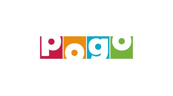
“The existing bright tones didn’t quite work together, so we looked to adjust these and consider various compositions to decide how flexible we should allow color usage to be across the entire on-air package,” Moloney says. “In the end, we agreed to redesign the logo by updating the letter forms, giving them perfect circles as their centers and adjusting the colors to feel more modern and vibrant.”
Out of this simple theme, the basis of the refreshed brand was conceived. Brought to life in a series of 3D assets, animations and idents, and music and effects conceived by sound designer Dave Meckin, the perfect circles of the logo became colorful, playful bouncing balls, jumping freely around the screen in 3D.
As is often the case, the simplicity of the brand belies a huge amount of work behind the scenes. Art&Graft has created a new set of design nuts and bolts to allow the brand to be flexible and dynamic, and also for it to evolve while maintaining the “sweet spot,” says Moloney, “between it being loads of fun to watch without it being too crazy.”
He adds: “We purposely kept the camera movements simple and direct and let the building blocks take centre stage throughout.”
“A key part of the brief was to deliver a functional design system that could be versioned and updated without difficulty in After Effects,” he says. “As such, we created a catalogue of 2D and 3D assets that became the building blocks for the entire rebrand package.
“We then developed a bold visual language that allowed us to create a broad and diverse range of assets across the channel as well as a playful and exciting motion language to bring it all together.”
Both designers and broadcasters will know very well that the ostensibly simple projects are never easy. Turner laid down the challenge to Art&Graft to carry on the good work at Pogo that was set in motion thirteen years ago, maintain consistency on the surface, and bring more smart functions and more flexibility behind the scenes.
Commenting on the final results, Desai says: “The overall channel look is more cohesive and less cluttered, giving the channel a rich, bold identity. The vibrant colors and dynamic graphics serve to uplift the mood of the channel to reflect the inherent positive and playful nature of kids.”
It’s not a radical shift for Pogo by any means, but with a new design manifesto and OSP in place, the channel’s nicely on track to take more of the Indian market, as per its own, ambitious plans.
CREDITS
Client: Turner Broadcasting
Agency: Art&Graft
Designed, directed and produced by Art&Graft
Creative Director: Mike Moloney
Head of Design: Will Mercer
Creatives: Jim Wheeler, Mikey Dowdle, Sam Bevington
Producer: Helen Randall
Music and Sound Design: Dave Meckin
Tags: