


__twocolumncontent.jpg)


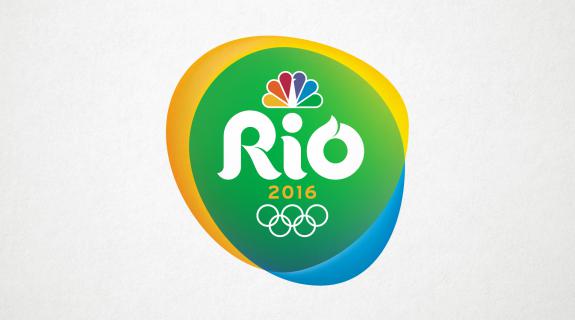
NBC Sports typically stays in-house for it Olympics logo design, but for the upcoming 2016 Summer Olympics in Rio de Janeiro, it worked with Trollbäck + Company. Together, the two creative forces have forged a mark that is somehow simple yet free-flowing, quietly elegant yet brimming with endless possibility.
“[NBC has] used landmarks and shield elements in a lot of those past versions,” said Mitch Monson, a creative director for Trollbäck + Co who lead the project. “With the spirit of Rio we were given the opportunity to expand on that and not be contained in the shield.”
Freed from having to conform to the boundaries of a shield shape, Trollback sought to “find something that had almost a living sense to it,” said Monson, “so that it could always be in motion.” What they came up with is almost thrillingly strange given the extent of the reach of the content it represents – all dreamy oblong shapes and shifting shades of color moving together in hypnotic undulation. “That was probably the most unique thing about our assignment,” said Monson. “We could be a little more abstract.”
In designing the logo, Monson’s team looked to the landscape of Rio itself as inspiration, and in particular, the unusual, double-sloped topography of the city’s famous Sugarloaf Mountain. In past NBC Olympics logos, he said, it was common for an iconic landmark from the given city to actually appear, clearly and directly, in the logo. See: the Great Wall of China in the 2008 Beijing Summer Olympics logo and Big Ben in the 2012 London Summer Olympics logo, to name just a couple).
The influence of Sugarloaf on Rio 2016, however, is much more subtle, its soft curves informing the look and feel of the logo without ever imposing themselves. Meanwhile, the logo’s bright hues of yellow, green and blue take their cue from the Brazilian flag, but also pair nicely with the city’s natural elements of sun, land and water. Combined, these malleable elements “don’t feel contained,” said Monson, which produces a “much bigger, more epic quality” befitting of a brand of the magnitude of NBC Olympics.
In addition to drawing on the physicality of the location, Trollback looked to Rio’s vibrant culture for inspiration. Their code name for the logo in its final form was “passinho,” which is also the name of a new form of Brazilian samba that fuses pop, funk and break-dancing. Monson said that the energy and flair of that dance style not only “influenced what we were doing with the shapes” but it “really affected what we were doing with the letter forms. There was a lot of fluidity with how those type elements connected to one another.”
Those swooping letters composing the logo’s typography are liltingly beautiful and appear effortless, like the brushstrokes of a skilled painter. They are also symbolically powerful, with the cresting lines of the “o” alluding to the flame atop the Olympic torch. Monson called the typography and how it expresses itself “the soul of this whole project.” Trollback + Co art director Josh Lynne, who headed up the typography design, said he “went through numerous variations of drawing the letterforms, slightly changing different elements which sometimes can throw the whole design off. Everything from placing serifs in different areas, the type and size of the serifs, some letters with and some without serifs, the weight of the letterforms, the curves and how to cheat them to balance the whole logo.” Typography is difficult to get balanced in any logo, but was especially daunting in this case, where three separate logos are ultimately present: NBC’s peacock, the Rio 2016 mark, and then the Olympics itself with the brand’s interlocking rings – “all of which have their own guidelines for usage and spacing,” said Lynne.
The final product has to live and breathe everywhere from a tiny bug in the corner of a broadcast to digital applications, to large-scale set pieces at live events, to every manner of merchandise from t-shirts to coffee mugs. And, it has to live on in history. “When they do something like this logo they don’t think about it as, ‘in two or three years we’re done,’” said Monson. “They really kind of honor it as something that lives in this NBC legacy.”
Added Lynne: “The logo was an amazing project and a wonderful opportunity. It’s not very often you have the chance to help brand the Olympics.”
Tags: