


__twocolumncontent.jpg)


Main title design has become a major brand focal point with TV franchises, whether it’s on broadcast or cable, a series or a one-time event. In many ways, the 15- or 30-second sequence has come to define a series more than anything else, creating an artform in and of itself.
Moderators Ellen and Lynda Kahn, co-founder and partners of TWINART, Inc., put together a panel of five designers, each representing one of these main title sequences, who broke down their processes and spoke about how some of TV’s greatest titles were created in “The Art of Title Design” at The Conference 2014.
Vikings:
The sea theme of History’s “Vikings” main title sequence actually stems from a dying man’s prayer, according to Rama Allen, creative director at The Mill+. The open, which was nominated for the 2013 Emmy for Outstanding Main Title Design, imagines what would happen “as you’re slipping away into the darkness,” he said.
Allen gathered historical information surrounding the Vikings along with their mythology before getting to work on this project, saying that a few themes that stuck out were blood, sex, supernatural and the death at sea. Incorporating those into the main titles were “a way to create an empathic connection to the culture,” adding that the eerie music was the start of it all - “I usually pick the music for the piece before I write anything.” The rest of the sequence was largely shot in a five-foot deep pool in New Jersey, adding the challenge of creating an open ocean feel in all of five feet.
2013 MTV VMAs:
The most important elements of the 2013 MTV Video Music Awards might have been the redesign of the iconic Moonman and the setting. For the first time, MTV would hold its awards show in Brooklyn, so The Mill+ set out to make the event mirror its location.
“We knew we wanted to show Brooklyn, and we had to do it a genuine way,” said Christopher Palazzo, director at The Mill+. So they set out in Brooklyn, meeting people and getting a feel for the scene, all while making sure the shiny statue of the Moonman made its way into the overall look and feel of the show.
Along the way, Palazzo and team found the aesthetic of mirrors to be pervasive across the neighborhoods of Brooklyn, so they used that look for the main titles and throughout the design of the show. With a grid of the logo or artists’ names, they flipped letter forms, mirrored typographic language and individually redesigned each category, each artist with a specific style reflecting the overall mirror strategy – “the design principle of mirrors permeated everything,” according to Palazzo.
True Detective:
“First, the showrunners told us the show would be about sex and death,” said Patrick Clair, creative director at Elastic, about HBO’s “True Detective.”
Finding out that time and place were very integral to the show, Clair says that their next step was focusing on landscape for the show’s title sequence. “We wanted to do the same [thing] in graphic design as they were doing in the drama,” he said, following on the theme of characters being exploited and then often thrown away.
With this in mind, Elastic used the idea of photographic double exposures with character and the land behind them, creating “portraits of our broken characters with this polluted landscape.”
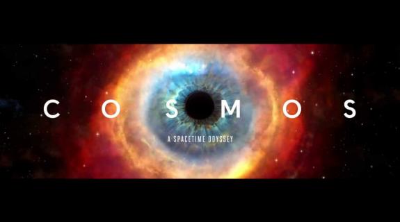
COSMOS: A Spacetime Odyssey:
Fox’s launch of “COSMOS: A Spacetime Odyssey” with Neil deGrasse Tyson was big for the broadcaster this March, re-launching the franchise Carl Sagan previously put on the map. Curtis Doss, creative director at Big Block Design Group was up to the task of starting off the opening titles, but hit a snag. “Branding this show is such a legacy,” he said. “The universe is your palette, until you start to think about what that means…”
With such broad subject matter to deal with, Doss focused in on the eye “as a way to bookend the spot,” also using the connection between big and small as a way to bring astronomical topics down to the human level – “the idea that something billions of miles away looks very similar to something as small as a shell on the beach.”
Wrapping up the main titles, Big Block Design Group wanted a nod to Carl Sagan, so they added in a small element that you may have to watch again to find. When the logo comes to the forefront, the letters C and S are the first one can see, the initials of the show’s first host and main science mind.
SNL:
Emily Oberman, partner at Pentagram, also created the opening titles for “30 Rock” and “The Tonight Show Starring Jimmy Fallon,” so she’s been firmly implanted in the late-night comedy space, and having worked on the opening for “Saturday Night Live” for years now, she went through the evolution of the design and video piece that opens the weekly sketch show.
“The brief for ‘Saturday Night Live’ is the same,” she said. “It’s always the same.” And while the show’s open hasn’t changed too dramatically in form over the years, small pieces of it have changed significantly. While the music has been the same for years, it’s gone through multiple logo redesigns, many changes in casting and a back-and-forth about how much to feature the city of New York.
In 2002, it was decided it was time to bring back a focus on the city from the previously graphic look in the opening sequence. This title sequence was full of color and animation with “the logo barreling through in big type,” said Oberman. The logo was redesigned in 2006 for the block lettering we see now, and more recently, there’s been a renewed look at incorporating the city into the titles. But instead of showing the city quite literally, they “really took a look at what makes the city,” said Oberman. Using lights inspired by the city at night, they redrew the logo using those dots that were then incorporated for each cast member.
Tags: